Simple Table
Simple Table is a lightweight component built upon FFTable, offering functionalities for creating complex table headers and footers with ease. Unlike FFTable, it doesn't include a built-in form for editing data, paging and sorting.
Features
- Complex header and footer layouts
- Dynamic row and cell styling
- Custom column formatting
- Responsive design
- Dark mode support
- Keyboard navigation support
- Screen reader accessibility
- Interactive hover states
Basic Implementation
Include the component in your view:
<f3:inject id="content">
<div x-data="data" class="max-w-screen-md">
<include href="blocks/simple-table.html" />
</div>
</f3:inject>
<f3:inject id="script" mode="append">
<script src="{{@BASE}}/js/fftable.min.js"></script>
<script src="{{@BASE}}/js/util.js"></script>
<script>
let data = {
table: {
fullWidth: true,
size: 'none',
display: 'compact',
containerClass: 'h-[60vh]',
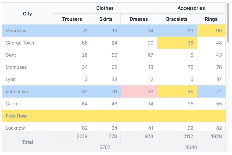
// Dynamic row styling
rowClass(idx, row) {
return {
'whitespace-nowrap': true,
'bg-blue-200': idx % 5 == 0
};
},
// Dynamic cell styling
cellClass(cidx, ridx, row, col) {
return {
'bg-red-200': ridx == 5 && cidx == 3,
'bg-yellow-200': row[col] > 95,
}
},
// Column definitions
columns: [
{ name: 'city' },
{ name: 'trousers', class: 'text-right', type: 'number' },
{ name: 'skirts', class: 'text-right', type: 'number' },
{ name: 'dresses', class: 'text-right', type: 'number' },
{ name: 'bracelets', class: 'text-right', type: 'number' },
{ name: 'rings', class: 'text-right', type: 'number' }
],
// Complex header with merged cells
customHeader: [
[
{ title: 'City', attr: { rowspan: 2 }, class: 'border-r border-t' },
{ title: 'Clothes', attr: { colspan: 3 }, class: 'border-r border-t' },
{ title: 'Accessories', attr: { colspan: 2 }, class: 'border-t' }
],
[
{ title: 'Trousers', class: 'border-r' },
{ title: 'Skirts', class: 'border-r' },
{ title: 'Dresses', class: 'border-r' },
{ title: 'Bracelets', class: 'border-r' },
{ title: 'Rings' }
]
],
// Footer with calculations
customFooter: [
[
{ value: 'Total', class: 'font-bold border-r text-center', attr: { rowspan: 2 } },
{ name: 'total-trousers', class: 'text-right border-r' },
{ name: 'total-skirts', class: 'text-right border-r' },
{ name: 'total-dresses', class: 'text-right border-r' },
{ name: 'total-bracelets', class: 'text-right border-r' },
{ name: 'total-rings', class: 'text-right' }
]
]
}
};
</script>
</f3:inject>Configuration Options
Table Properties
fullWidthMake table fill container width
sizeTable padding size: 'sm', 'md', 'lg', or 'none'
displayDisplay style: 'default' or 'compact'
containerClassCSS classes for the table container
roleARIA role attributes for accessibility (automatically set)
aria-labelScreen reader description (automatically set to "Data table")
Dynamic Styling
rowClass(idx, row)Function to return classes for each row
cellClass(cidx, ridx, row, col)Function to return classes for each cell
Column Configuration
nameColumn identifier matching data field
classCSS classes for the column
typeData type: 'text', 'number', 'date', etc.
Complex Headers & Footers
customHeaderArray of row arrays for complex headers
customFooterArray of row arrays for complex footers
titleHeader cell content
valueFooter cell static content
nameFooter cell dynamic content from data
attrHTML attributes (colspan, rowspan)
Best Practices
- Use semantic column types for proper data formatting
- Implement responsive classes for mobile compatibility
- Use consistent border classes for merged cells
- Add descriptive headers and footers for data clarity
- Implement dynamic styling for better data visualization
- Ensure table headers have meaningful descriptions for screen readers
- Test keyboard navigation for accessibility compliance
- Maintain sufficient color contrast for hover and focus states
Accessibility Features
Keyboard NavigationRows are focusable using Tab key
ARIA RolesSemantic table roles for screen readers
Focus StatesVisual indicators for keyboard navigation
Screen Reader SupportProper table structure and labeling
Properties
fullWidthBoolean, to use full width of container or flow as content width
displaycompact|normal specify padding between cellscontainerClassclass for container
rowClassclass for row, can be a constant or a function that receive index and data as parameter.
cellClassclass for cell, can be a constant or a function that receive col index, row index, data and col
name as parameter.
customHeaderDefine non standard table header. If undefined, standard table header created from columns
definition.
columnsData Structure definition for Simple Table
datadata to be rendered. There is special row that has "__customRow" property where we can display
anything. Usually when we want to draw separator.
customFooterDefine complex footer
footerDatadata for customFooter
Interactive States
HoverLight highlight on row hover (bg-gray-50 in light mode, bg-gray-600 in dark mode)
FocusDistinct highlight when row is focused (bg-gray-100 in light mode, bg-gray-500 in dark mode)
See demo here